Today’s activity is a follow up from last week’s activity. As I had mentioned in my last technical report, the X, Y, and Z points we acquired from our survey were going to be imported into Arc Map to create a real-life replica of the actual landscape we created in our planter boxes. To do this we used different types of interpolation methods, and then observed those methods in a 3-D version in Arc Scene. We were then instructed to evaluate the different methods and decide which one we felt best matched our survey. From there were asked to resurvey our landscape terrain and use our critical thinking skills to improve our survey in ways in which it may have been lacking from the first survey. Again, we were to import our points into Arc Map and create an interpolation method that we felt replicated our actual terrain the best.
Methods
To start the second part of this project we began by
importing our X, Y, and Z coordinates into Arc Map (Image 1).
Image 1: Survey points
imported into Arc Map from our first survey

Image 2: Initial X, Y, and Z values imported into Arc Map from our Microsoft Excel file from our first survey

The Z values have
decimal points in them since as we measured to the nearest half centimeter
So, we decided we needed to get rid of them. We did this by
multiplying all our X, Y, and Z values by 10 in Excel (image 3). This works
because it essentially moves the decimal place over to the right once. This, in
turn, left our values with no decimals.
We also titled the initial values columns with a 1, example X1, Y1, and
Z1, and titled the new columns X, Y, and Z. Again, we did this to keep
everything simple as to prevent Arc Map and Excel from not working properly
with one another.
Image 3: Microsoft
Excel after all values were multiplied by 10 and column titles were changed

The function equation
located above columns D and E depicts the equation that was used to change the
numbers for the Z values. This same method was used for the X and Y values but
with their appropriate equation.
We then imported the new values into Arc Map. Again, we
exported the shape file into our geodatabases as feature classes, and brought
the new feature class of our points into Arc Map (image 4) to run the
interpolation tools.
Image 4: Survey points
imported into Arc Map from our first survey
The points are the
same as the ones in image 1, the only difference between them is that image is
a shape file and this image is a feature class.
Finally, the tools executed the different types of
interpolation methods properly. Interpolation methods we used included inverse
distance weighted (IDW), Kriging, Natural Neighbor, Spline, and triangulated
irregular network (TIN). The first method we ran was IDW (image 5). IDW creates a continuous surface by estimating cell values by averaging the values of sample data points in the neighborhood of each processing cell. IDW is considered a deterministic interpolation method because it is directly based on the surrounding measured values or on specified mathematical formulas that determine the smoothness of the resulting surface. This method assumes that the variable being mapped decreases in influence with distance from the sample location.
Image 5: IDW

The next method we ran was kriging (image 6). Kriging works
by generating an estimated surface from a scattered set of points with z
values. Unlike IDW, kriging is considered a geostatistical method. A
geostatistical method is based on statistical models that include autocorrelation;
that is the statistical relationship among the measured points. Because of this,
geostatistical techniques not only have the capability of producing a prediction
surface but also provide some measure of the certainty or accuracy of the
predictions.
Image 6: Kriging

Then we ran natural neighbor (image 7). Natural Neighbor
finds the closest subset of input samples to a query point and applies weights
to them based on proportionate areas to interpolate a value. Its basic
properties are that it’s local, using only a subset of samples that surround a
query point, and interpolated heights are guaranteed to be within the range of
the samples used. It does not infer trends and will not produce peaks, pits,
ridges, or valleys that are not already represented by the input samples. The
surface passes through the input samples and is smooth everywhere except at
locations of the input samples.
Image 7: Natural
Neighbor

Next we ran spline (image 8). Like IDW, spline is considered
a deterministic method. Spline uses an interpolation method that estimates
values using a mathematical function that minimizes overall surface curvature.
This results in a smooth surface that passes exactly through the input points.
Conceptually, the sample points are extruded to the height of their magnitude;
spline bends a sheet of rubber that passes through the input points while
minimizing the total curvature of the surface. It fits a mathematical function
to a specified number of nearest input points while passing through the sample
points. This method is best for generating gently varying surfaces such as
elevation.
Image 8: Spline

Finally, we ran TIN (image9). TIN creates a triangulated
surface that does not deviate from the input raster by more than the specified
Z tolerance. First, a candidate TIN is generated using sufficient input raster
points (cell centers) to fully cover the perimeter of the surface. It then
incrementally improves the TIN surface until it meets the specified Z
tolerance. It does so by adding more cell centers on an as-needed basis during
an iterative process.
Image 8: TIN

After all the different types of interpolation methods were
ran we brought them into Arc Scene. Arc Scene allows it’s user to observe a
raster in 3-D (the continuous surface created by interpolation methods results
in a raster file) (image 9-13). Here we were able to observe all our surfaces
and decide which one depicted the true surface terrain we were trying to
capture.
Image 9: 3-D view of
IDW
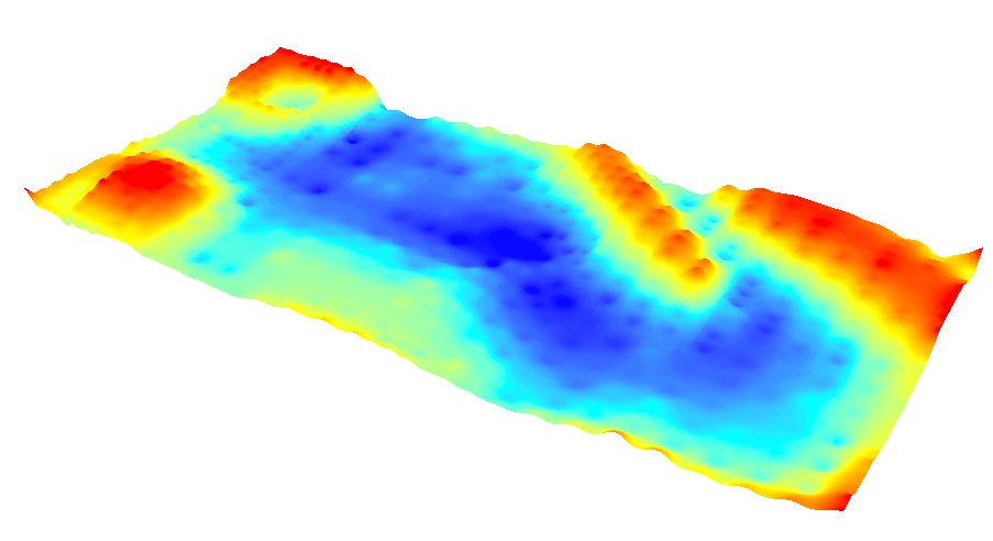
Image 10: 3-D view of
Kriging

Image 11: 3-D view of
Natural Neighbor

Image 12: 3-D view of
Spline

Image 13: 3-D view of
TIN

Overall, I thought all the different methods did a great job
at depicting our terrain. However, I thought that spline did the best job. This
is probably because this specific technique works well for elevation surfaces
and creates such a smooth looking surface. As we discussed earlier, spline is
considered a deterministic interpolation method because it is directly based on
the surrounding measured values or on specified mathematical formulas that
determine the smoothness of the resulting surface. Since we sampled every 5 or
10 centimeter increments our sample points were very close together. Since this
method is based on surrounding measured values I feel cell values were calculated
appropriately for our surface. Also, since our land terrain was made of snow
and was created with us wearing gloves and mittens, there were no elongated or sharp
objects used in the creation of the surface, it makes sense that a smooth
looking surface worked well for this. This technique allowed the smooth surface
of the raster to depict the smooth surface of the actual terrain.
The next step in this project was to resurvey our surface
terrain. After examining our 3-D surfaces we needed to determine areas where
more survey points were needed to make our 3-D models more of an accurate
description of our terrain. Together, we brain stormed on what we could do
differently to make our survey better. We decided that we really liked our
first survey method, but came up with a few cool ideas on what to do
differently and thought of a few extra tools to bring with us this time.
Like the first survey, we agreed to keep the coordinate system the same
with the short end of the planter box be X axis and the long edge be Y axis. We
also agreed to do our survey at 5 and 10 centimeter increments on the X and Y
axes. If there was a lot of terrain feature to capture, such as a ridge or
depression, we did 5 centimeter increments; this is so we would capture a more
accurate, real-life surface elevation. If there wasn't much terrain feature to
capture, such as a plain, did 10 centimeter increments. We also decided to keep
taking our Z value measurements to the nearest half centimeter.
We also used a lot of the same tools we had the first time, such as
measuring tapes, meter sticks, and tape. However, this time around we agreed to
use string and thumbtacks to assist us with making our survey more accurate.
Again, we printed off more Excel spreadsheets to record our X, Y, and Z values
and thought to bring a clipboard with to make recording our values easier.
We also remembered to dress very warm. The first time we did our survey it
was 15F outside and we needed to keep coming inside to warm up, which wasted a
lot of time. The day of our second survey it was about 25F outside. It was a
little warmer, but we knew it wouldn’t take long to get cold if we didn’t dress
appropriately for the weather.
To begin our second survey we needed to reshape our surface
terrain since it had snowed since the last time we were out there (images 14
and 15).
Image 14: Our surface
terrain 3 days after our first survey

Image 15: Reshaping
the landscape

Then we established our X and Y axes. We started this by
creating X axes through the interior of the box. We did this by first laying
two measuring tapes on both X axes. Then, we used the thumbtacks and placed
them into the wood on the X axis at every 10 centimeter increment (image 16 and
17).
Image 16: Placing the
thumbtacks in the wood at every 10 centimeter increment on the X axis

Image 17: The X axis
complete with thumbtacks at every 10 centimeter increment

Once all the thumbtacks were in place at their 10 centimeter
increments we removed the measuring tape. Then we used the string to create X
axis throughout the center of the box. Creating 10 centimeter X axes all
through the center of the box provided us with a higher degree of accuracy. We
only did 10 centimeter increments instead of 5 because we didn’t intend on
taking every 5X5 centimeter measurement, as discussed earlier. We started this
by tying one end of the string to the end thumbtack on the planter box (image
18).
Image 18: Tying the
end of the string to the thumbtack

Then we laced the string around the thumbtack straight down
on the opposite end, and then over to the thumbtack next to it (image 19). We
laced the string around the thumbtacks instead of tying it off and starting
over to save on time.
Image 19: Lacing the
string around the thumbtack

Next, we placed the two measuring tapes on the Y axis of the
planter box (the long edges) and taped them down (image 20). We taped them down
so they wouldn’t move; this would also create greater accuracy. We could have
tacked them into place but the measuring tapes didn’t belong to us and we
didn’t want to vandalize property that wasn’t ours. Having a measuring tape on
both Y axes allowed us to measure in both 5 and 10 centimeter increments.
Image 20: Placing the
measuring tapes down on the Y axis

Since the end of the measuring tape didn’t exactly start at
0, we started the measurement at 10 (image 21). So, 10 was our 0 in reality.
Image 21: Starting our
Y axis measurements at 10

Finally, our the strings were in place for our 10 centimeter
increments on the X axis and the Y axis were in place (image 22)
Image 22: Our 10
centimeter increments on the X axis with string and our Y axis completed

Next, we had to finish our X axis. Like the first time, we
decided to use a mobile X axis again. A mobile X axis allowed us to find the
exact spot where the X and Y axes lined up. Since a meter stick alone was too
short to lay across the planter box we used a measuring stick that was in
inches that laid all the way across.
As was discussed earlier we agreed to take 5X5 increment
measurements if there was a lot of terrain feature to capture. However, the
string only provided us with 10 centimeter increments, so we still needed a
solution for 5 centimeter increments. We could have just eye-balled it up
between two 10 centimeter strings and estimated where a 5 centimeter increment
would’ve been, since 10 centimeters isn’t very large to begin with, but we knew
that wasn’t an accurate way to do it. So, we taped a meter stick to the top of
the other stick (image 23). This worked out perfect for measuring increments. The
length of the meter stick was short by 5 centimeters on each end in comparison
to the planter box. By keeping the meter stick at the 5 centimeter increment
lined up with the actual 10 centimeter increment of the first string (same went
for the opposite end of the stick and last string), we were able to keep the 5 centimeter increments lined up where
they were supposed to be to keep our measurements accurate. So here 0
centimeters marked 5 centimeters.
Image 23: Meter stick
taped to the top of another measuring stick that provided a mobile X axis for a
5 centimeter increment

This coordinated system worked out very well, once again. By having measuring tapes on
both Y axes we were able to make sure our mobile X axis was straight across and
not at an angle, which again lead to greater accuracy.
Finally, we were physically able to take the survey. To do this we laid the
mobile X axis across the box making sure it lined up at the evenly on both Y
axes. Then one team member held the meter stick, used for measuring elevation,
down to the top of the land surface in the appropriate spot of the coordinate
system. Elevation was measured from the distance of the bottom of the long
measuring stick of the X axis to the top of the land surface (image 24). Once
the stick was in place another team member read the measurement off to the
recorder, and final team member recorder the elevation and coordinates onto the
Excel spreadsheet. To be the most time efficient for taking all of the
elevation measurements we began our survey at X=0 and Y=0. We continued all the
way down the X axis before moving the mobile X axis up 1 increment on the Y
axis, and again worked our way down the axis.
Image 24: Depicts how measurements of land
elevation were measure using our coordinate system

This measurement would’ve been recorded as having
an elevation of -13 centimeters
After all the elevation measurements were taken and our box parameters were
taken measured and recorded, which came out to X=112.5cm, and Y=224cm, we were
done with the physical part of the second survey. Next, we had to repeat the steps outlined at the beginning. First, we had manually enter our values into Excel and multiply our columns by 10 to get rid of the decimal points (image 25).
Image 25: Microsoft Excel file for the second
survey once all the values were entered and multiplied by 10

Then, we had to import our values into Arc Map, export the shape file of
them into our geodatabase as feature classes, and add the feature class file to
Arc Map (image 26). (image 27 is being provided for comparison purposes of
survey 1)
Image 26: Feature class file of the values from
our second survey

Image 27: Feature class file of the
values from our first survey

Finally, we were asked to create the interpolation method that we felt best
worked for our data (image 28). We were instructed to compare it to the first
survey we took (image 29) to see how it compared and if more surveying was
needed.
Image 28: Interpolation method we felt best
represented our surface terrain

Image 29: Interpolation from first survey for comparison

Discussion
This project helped me realized the importance of critical thinking and
team work. It is amazing the ideas you can come up with when you collaborate
with fellow colleagues, and keep an open mind and positive attitude. Things
aren't always going to go the way image them inside your head. This project
definitely proved to have its challenges. I honestly wasn't expecting to come
up with so many problems while taking this survey. One factor can influence the
path you have to take to get something done. It can be as simple as not having
enough people to get the job done as you anticipated to, or something on much
larger scale such as the weather. The first day we did our survey it was about
15F outside and was very cold. For the second survey it was about 25F, so it
was still cold, but a little warmer. However, we knew to come prepared. This
time around we had a better idea of what to expect for the survey as well. This
was helpful because we were able to come prepared with more tools to get the
survey done. One tool that would’ve been useful and provided a more accurate
survey would’ve been some sort of a measuring tool with a smaller, or pointier,
end for measuring elevation. This is because the meter stick is approximately 1
inch in length, so it doesn’t provide an accurate reading where there is a lot
of relief, such as going up a hill or ridge.
Conclusion
Overall I feel as though I learned a lot from this project. I was really surprised at how much I felt like
the second survey was done much more professional by using more accurate
measuring techniques. This exercise challenged my ability to think spatially,
along with utilizing my critical thinking and team work skills. I thought that
our team worked great together! The first time around it was just Phil and me,
and I was surprised at how well we collaborated our ideas together to get the
survey done. For the second survey it was even more surprising to me all the
ways we thought to improve our survey. Overall, I couldn’t tell much of a
difference between the two surveys while examining them in the 3-D view, but
felt confident that by doing a second survey I learned much more. I also
learned the importance of coming prepared. For the second survey our team split
duties for bringing in more tools. Things as simple as tape, thumbtacks,
string, and a clipboard can make a world of difference for whatever challenges
or obstacles that may come. I also learned the importance of coming prepared
for the weather. If you’re cold and wet it’s hard to think and stay focused
when in the back of your mind you’re really just thinking about how cold you
are and how you just want to be done. That type of mind set can have a big effect
on your overall work ethic and results. The only thing I can think to improve
this activity would be for it to be warm. However, that’s just a personal
preference. The fact that it was cold, I feel, challenged me to learn more and
take more away from this activity.
No comments:
Post a Comment