The purpose of this activity was to create a navigation map
that will be used for the following field activity. That activity will involve
manually plotting waypoints and their associated coordinates that will be provided
for us by the professor. To create this map several data sets were provided for
us. From the given selection we were to create a map that would provide us with
the ability to know the terrain we are traversing; as well as being able to
plot the points within reasonable accuracy. This map also needed to include
some type of coordinate system that would be appropriate for conducting a
survey at a large geographic scale at the local level.
Methods
To begin, the first thing we did a class was go outside and
establish our pace count. A pace count provides you with ability to know how
many steps you take within a given distance. We did this because this will be
our method for measuring the distance we travel during our survey for the
following week. To do this we used a distance finder and established a distance
of 100 meters. Then, the class walked to the distance 2 to 4 times to get an average
consistency. My pace count was about 68-70 steps within the 100 meter distance.
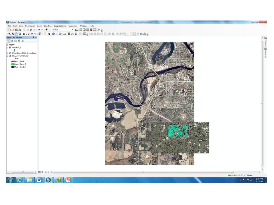
Next, we went inside and started on to create our maps. Data
set provided to us by the professor included color and black and white aerial
images, a digital elevation model (DEM), a 2-foot contour line map, a 5-foot
contour line map, a clipping boundary, and a point boundary. It was our choice for
what which data sets we chose to utilize. We were given the guidance of being
told that some of the best maps for this type of project are simple ones.
Having a map that is “too busy” can impede on the navigation. We were also told
we could make a two-sided map for reference purposes.
With that, I chose to use both the 2 and 5-foot contour data
sets (images 1 and 2), the point boundary data set (image 3), and a 50x50 meter
grid (image 4)for the main navigation map that will be used to plot the points.
The 2-foot contour file was generated during a UWEC survey and the 5-foot
contour file was generated from a 1/3 arc second DEM
that was obtained from the United States Geological Survey (USGS) seamless
server. I chose both the contours because together they create a very
precise, yet simple, vision of the landscape terrain. The point boundary data
was created for us by our professor. I used to the point boundary data set for
reference of the specific area the points will be located within. Finally, the 50x50
meter grid is a feature that is created in Arc Map. I chose a 50x50 meter dimension because I felt
it was detailed enough for the terrain, and because I didn’t want the grid to
be “too busy” and distracting. This size also works well because our pace count
was based on 100 meters so I would be able to cut my pace count in half, to
about 34-36 steps per 50 meters. This would also provide better accuracy.
Image 1: 2-foot contour
map used for representation of land terrain

Image 2: 5-foot contour
map used for representation of land terrain

Image 3: Boundary of
area where points will be contained

Image 4: 50x50 meter
grid used to for distance measurements


I also chose to create a second map for the backside of my
main map for reference purposes. This would include a color aerial image of
survey area (image 5), the 5-foot contour, and the point boundary data sets;
along with the 50x50 meter grid. Again, the aerial image was produced by the
USGS, like the 5-foot contour file. I chose the colored image because it would
be easier to depict the landscape, as opposed to a black and white image. I
chose the 5-foot contour because it is detailed, easy to reference with it also
being on the main map, and not “too busy”. I chose the point boundary, again to
know the specific location in which the points would be located. Finally, I
chose the 50x50 meter grid, again for reference to the main map.
Image 5: Aerial image
of survey area

The actual process in creating the map was a little more
difficult than any of us were expecting. We thought it was going to be as
simple as bringing the data sets in, setting the layers data frame to UTM 15 (which
is the projection we were instructed to use because it allows the ability to
measure distance), and adding the grid. However,
the problem we ran into was that the 2-foot contour map was a CAD file that was
originated by a UWEC survey. In order to use this CAD file in ArcMap it had to
be georeferenced to a raster. This process was done for the class by another
geospatial technician who works in the Geography department at school. He
informed us that he georeferenced the CAD file to the aerial image (which is a
raster), which had a different projection from the UTM 15. The aerial image was
originally projected in NAD83 Wisconsin Transverse Mercator. Therefore, when
the data frame was projected to UTM 15 the 2-foot contour map didn’t line up
correctly.
So, we collaborated as a class and figured out how to use
the data sets we needed; while having all the proper projections. The steps we took
to do this include the following:
1)
We started a new project in ArcMap and set the
page layout to a landscape view, with 11x17 dimesions (image 6).


Image
11: First step in creating a grid in ArcMap

Image 12: Setting grid’s
projection and defining it’s dimensions

Image 13: Creating labels for
the grid

Image
14: All components in ArcMap to create our navigation maps, with proper
projections


Image
15: Final main navigational map completed

Image
16: Final reference map completed

It was a good thing we worked together on this as a team. I’m
sure the issue with not having the correct projections would’ve messed a lot of
people up in the navigation part of the survey for the following week. Since
our survey will be based off of distance and direction it’s important to have a
map where whose components match our survey techniques. The UTM projection is a
good one for this project because it minimizes distortion of properties, such
as shape, distance, direction, and area.
Conclusion
Overall, I think everyone benefited from team work. It will
be exciting to see how well our map designs benefit, or hinder us in the field.
No comments:
Post a Comment